T-shirt
Oversized back print
Small CBC detail at left chest

First drop concept studio
Three typography-led graphics, each adapted for a T-shirt, hoodie, and tote bag. The words, Bowlby letterforms, scale, spacing, and color do all the work.
Concept art only. Confirm blanks, print method, final separations, and physical proofs before production.
Concept 01
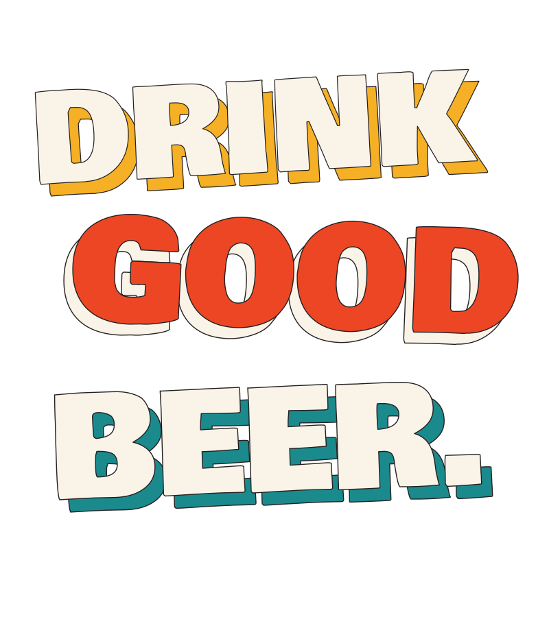
A typography-only lockup that gives every word its own weight, offset, and color. The tight stack and uneven baselines make the phrase the entire graphic.
Small CBC detail at left chest
Centered above the pouch
Nearly edge-to-edge like a beer poster
Concept 02
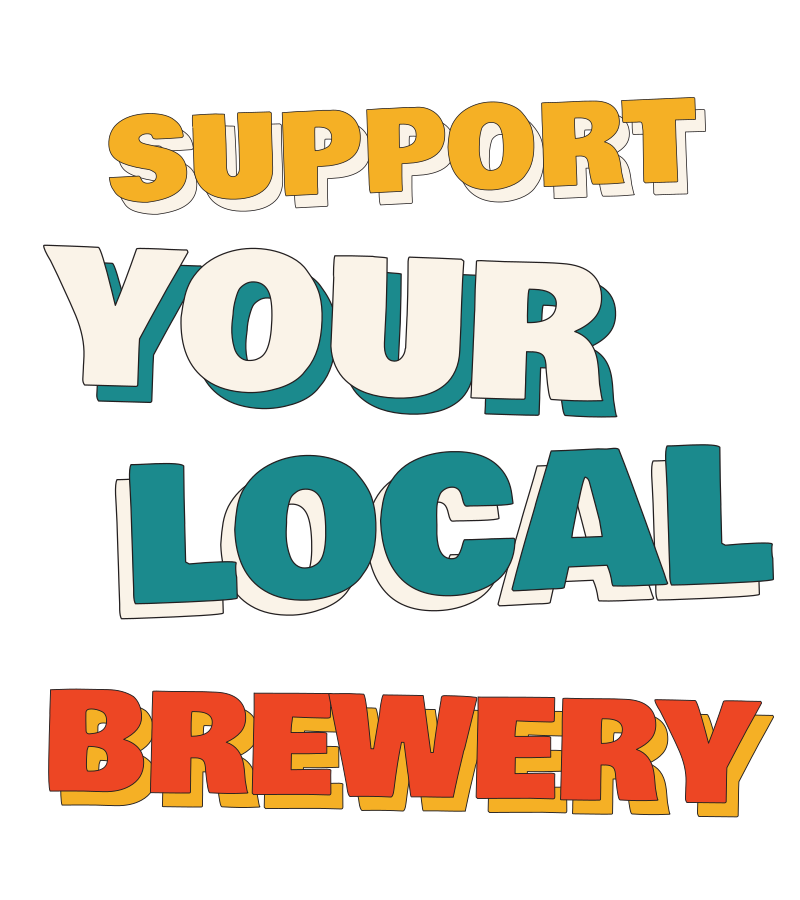
Four expressive lines with extra emphasis on YOUR and LOCAL. Color, scale, overlap, and imperfect alignment carry the full design without a badge or illustration.
Classic brewery-shirt placement
One-color pint at left chest
High-contrast market tote
Concept 03
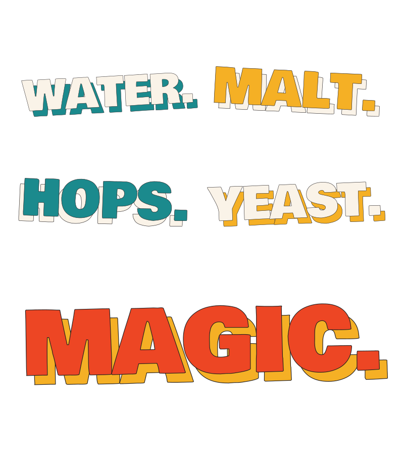
A two-by-two ingredient field with MAGIC given the largest, loudest line. The periods, contrast, and shifting word angles provide the rhythm.
Poster-like square composition
Compact enough to clear the pouch
Ingredient chart becomes the bag face
Collection logic
The first graphic is a loud core statement. The second puts the emphasis on YOUR LOCAL. The third turns the ingredient list into a typographic rhythm. Together they give the launch range variety through type alone.